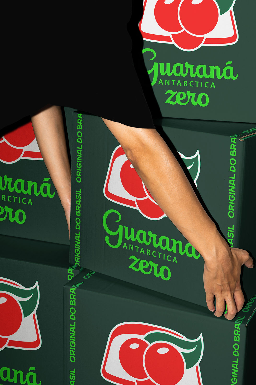
GUARANÁ ZERO
To elevate its Zero Sugar range, I reimagined its originality through a lens that balances legendary status with a bold graphic expression.
My goal was to ensure the design functions as a natural expansion of the brand's DNA, blending contemporary codes with classical assets.
The idea was simple: refresh the identity centered on a deep green canvas where ZERO is no longer just a product benefit, but the hero of the visual narrative.
By treating the redesign as an evolution rather than a replacement, we strengthened Guaraná’s presence in the global sugar-free segment while maintaining a modern bond with its iconicity.
My role was to translate this strategic vision into a powerful visual asset. The core of this evolution lies in the custom lettering for ZERO, which I sculpted directly from the geometry of the original Guaraná logotype.
Instead of introducing a foreign typeface, every letter was born from the fragments of the heritage logo, creating a seamless dialogue between tradition and innovation.
Every element, from the amplified scale to the technical claims, ensures that Guaraná Zero looks as iconic as it tastes