HOUSE OF CREATIVITY
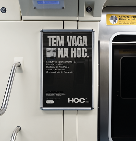
To redefine HOC's visual identity, I built a system that reflects the agency's greatest asset: people. The challenge was to create a contemporary and elegant identity that could support meaningful relationships while expressing creativity, strategy, and collaboration through
a cohesive visual language.
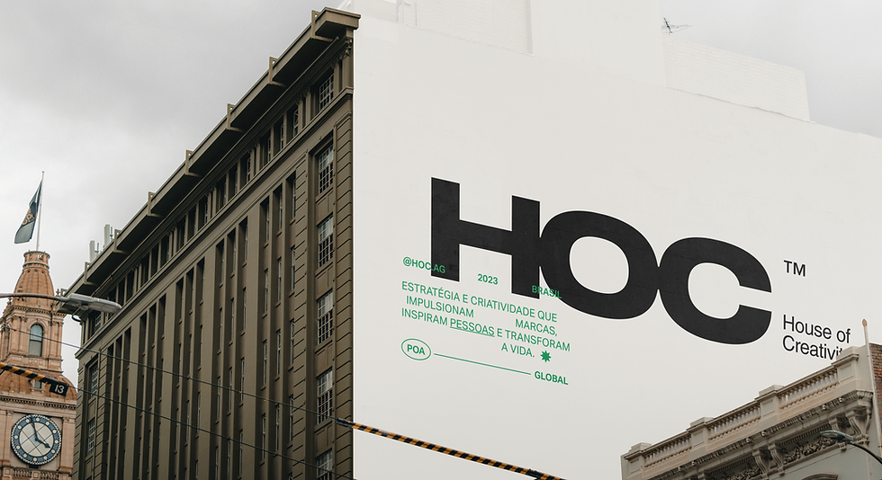
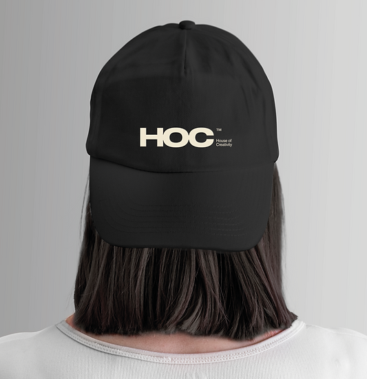
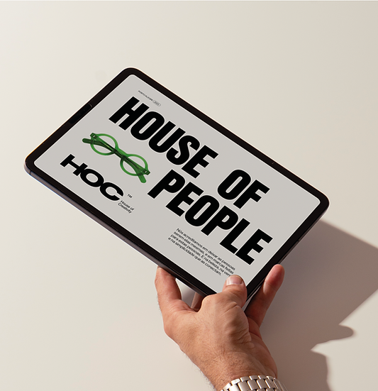
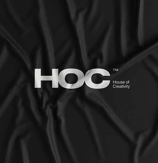
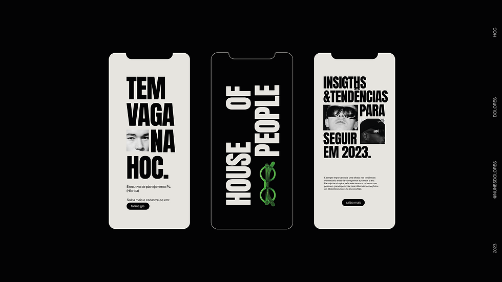
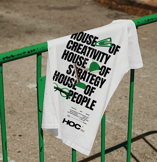
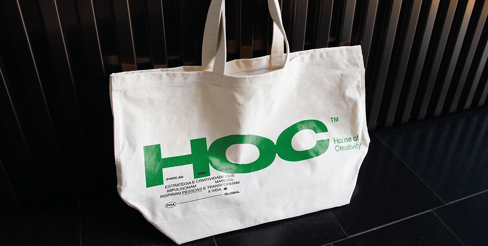
The concept emerged from the name itself. House of Creativity naturally expands into a House of Strategy and, above all, a House of People. This idea guided the redesign of the logo, introducing stronger proportions and a more structured construction that conveys the agency's growing maturity.
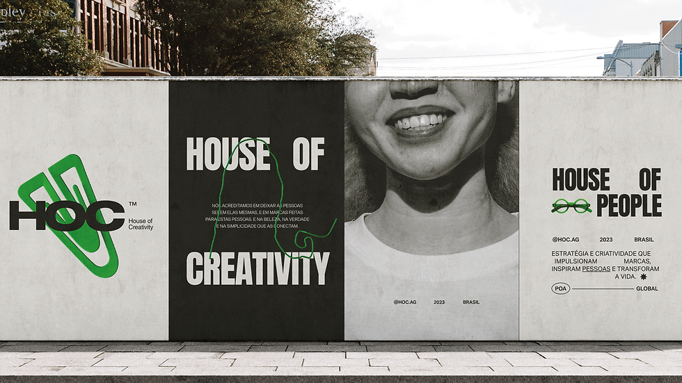
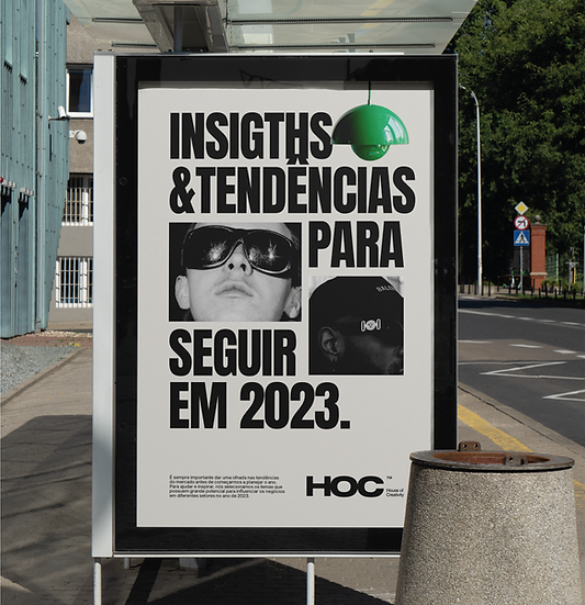
My role was to translate this concept into a flexible identity system. A restrained palette of black, off-white, and emerald green balances sophistication with vitality, while authentic black-and-white photography reinforces the human dimension of the brand.
Supporting graphic assets add rhythm and adaptability, creating an identity that is both consistent and open-ended. The result is a visual language designed to evolve with HOC, expressing the belief that every great creative house is ultimately built by people.