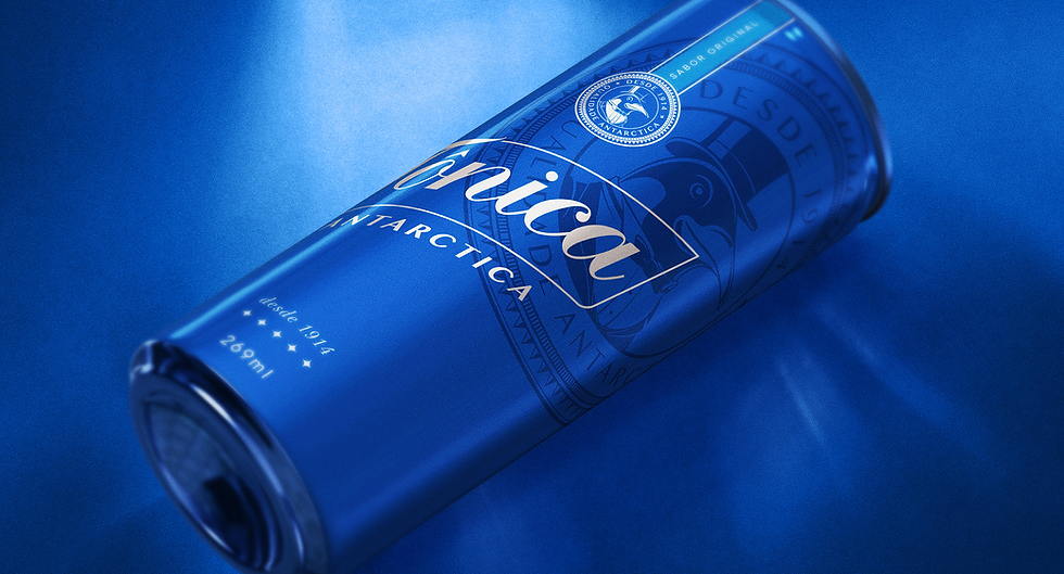
TÔNICA ANTARCTICA
The redesign of Tônica Antarctica’s packaging, Brazil’s first tonic water brand, established in 1914, aimed to reposition this iconic heritage brand within contemporary premium cocktail culture, moving beyond traditional soft drink codes toward a more sophisticated and aspirational mixer identity.
Under the concept “An Icon at Its Best Version,” the visual identity introduced a distinctive blue territory, combining a signature script wordmark, a heritage-inspired quality seal, and layered graphic patterns. Antarctica’s iconic penguin was also reimagined wearing a top hat, reinforcing the brand’s premium positioning while preserving its heritage.
My role focused on ensuring design consistency, technical accuracy, and executional excellence from concept development to final production. This included reviewing and refining visual elements, validating Pantone color specifications, revising dielines, checking final artwork, and overseeing technical details to ensure the creative vision was accurately translated across all packaging formats.
The result is a refreshed packaging identity that celebrates over a century of brand heritage while embracing contemporary mixology, balancing strong retail recognition with a sophisticated presence in bars and cocktail settings.
LAD Awards 2026
Beverages Packaging
Bronze